In 2014 NOOK decided to further evolve their “Paper” design style. The NOOK HD and HD+ were doing well.
Pre-orders for the NOOK HD were up 240% and their future forecast was “poised for tremendous growth” along with a helping cash infusion from Microsoft and talk of a European expansion.
The NOOK design team aligned with an outside user experience agency to evolve the NOOK HD, HD+ and mobile platform devices to create a more unified and cohesive user experience. This process involved seeking input from many varied resources including product managers, UX/researchers, visual designers and finally the engineering team.
The ux/design team began with an in-depth ‘discovery’ process that involved a deep dive into developing NOOK user personas and identifying both user and business needs around customer journeys.
These outcomes were defined and then synthesized into a living document of our core ux principles and used as part of the guide for our design process. They highlighted behavioral patterns, customer needs and pain points. Five core ux principles were agreed upon. Each principle was grounded in user needs but was further defined by the business goals, experience goals and user goals.
The next steps centered around a series of strategic design studios created to flush out the “big idea’ for our Paper 2.0 evolution. Five design teams spent 2 weeks defining their aspirational vision, visual strategy and alignment with our core ux principals. This massive amount of visual exploration was distilled down until we arrived at 3 core visual principles that guided and lead the final visual strategy.
In essence we arrived at a shared visual language any designer/developer could use to further expand the NOOK vision. We created clarity and alignment around the NOOK brand and what it strives to provide.
MY ROLE
I was an integral participant during the discovery and visual development phases helping to build upon a constantly expanding vision. Was part of the team that defined the visual direction for the final core design language principles.
As the initial ux/design team disbursed and moved onto other opportunities outside the NOOK design team I continued to expand, iterate and polish the visual language. Each NOOK feature area still had to be thought through and our new visual language needed to be applied across the entirety of all NOOK devices and sizes.
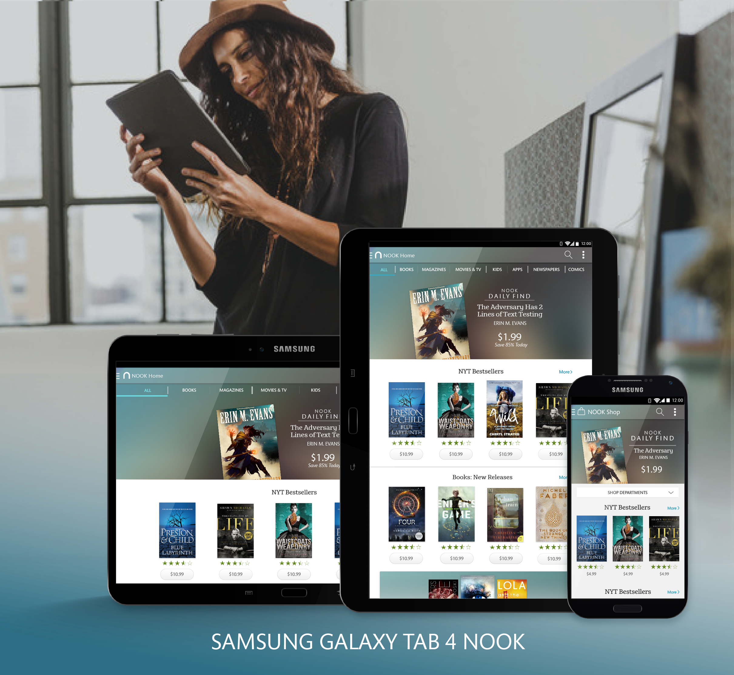
Working with a ux strategist, product manager and NOOKS business interests, together we arrived at a final NOOK vision for the new Samsung Galaxy, 7 & 10in., and android mobile platform.


