NOOK REBRAND - THE back STORY
In 2014 NOOK decided to further evolve their “Paper” design style. The NOOK HD and HD+ were doing well. Pre-orders for the NOOK HD were up 240% and their future forecast was “poised for tremendous growth” along with a helping cash infusion from Microsoft and talk of a European expansion.
The NOOK design team aligned with an outside user experience agency to evolve the NOOK HD, HD+ and mobile platform devices to create a more unified and cohesive user experience. This process involved seeking input from many varied stakeholders including product managers, researchers, interaction designers, visual designers and finally the engineering team.
Building on a solid foundation of NOOK customer satisfaction as reflected with the highest rated reading app on both iOS and android the NOOK product team’s goal was to further align and improve upon this success across all platforms. Thus, the Unified App Strategy was proposed outlining three key components.
RETENTION - Build a unified NOOK experience across all platforms providing consumers with better optimized device integration with OEM devices and retail partners.
ACQUISITION - Deliver the best reading, discovery and shopping experience to a broader range of NOOK consumers.
REVENUE - Maximize key business metrics to deliver profit and growth.
1. DISCOVERY
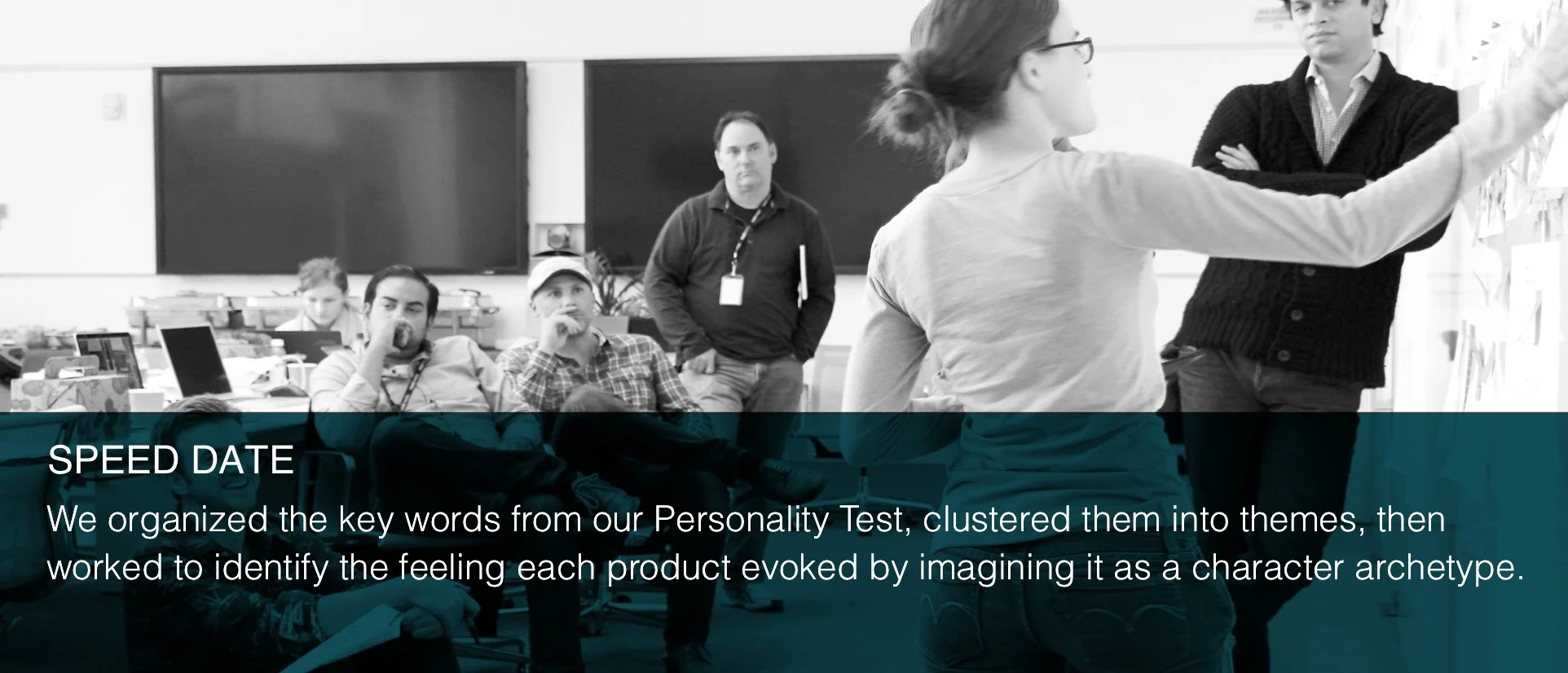
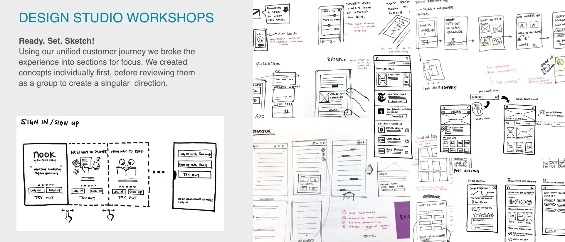
The fist phase started with a series of workshops called the Discovery phase. The aim of the Discovery workshops were to:
align all teams with the strategic direction of the project
build a shared understanding and agreed upon design language
share findings and insights for strategic use throughout our process
have a great time!
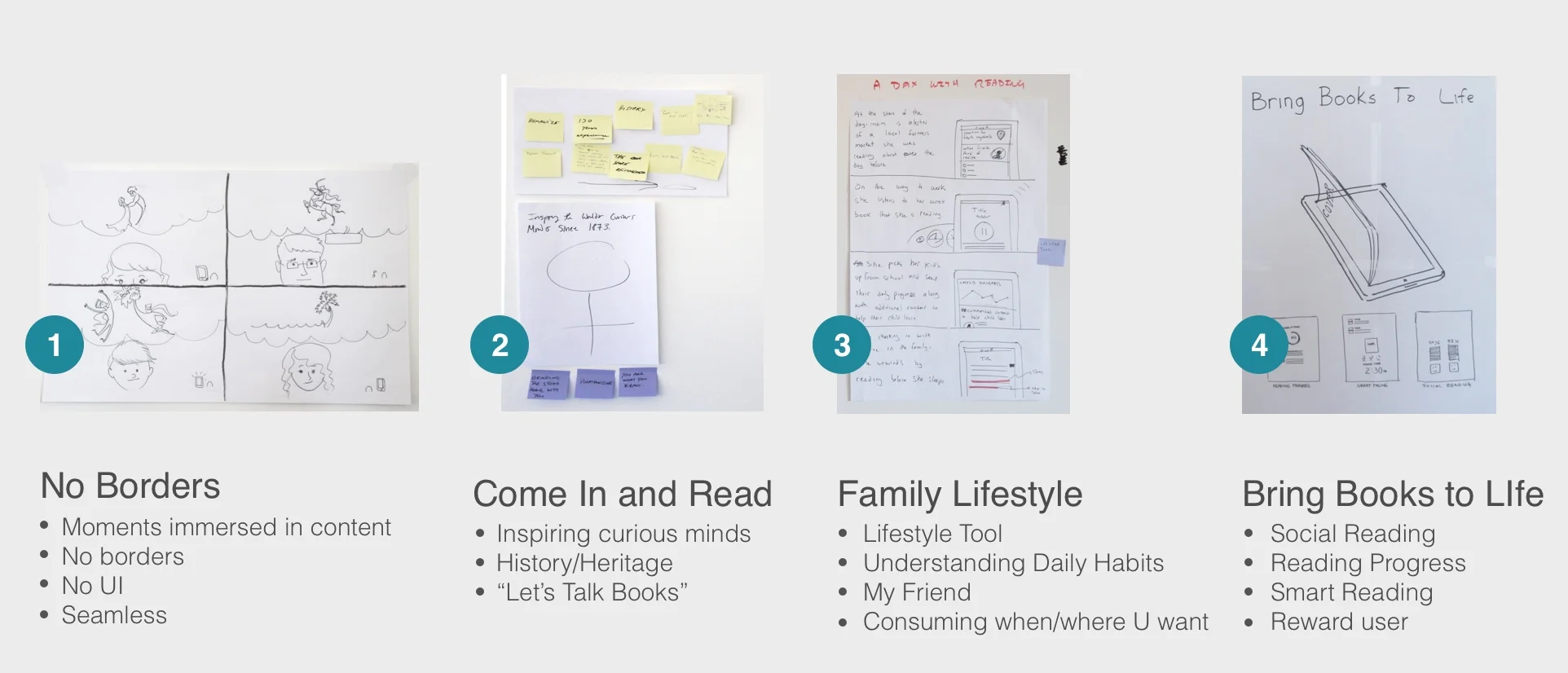
As the team moved thru the various workshops a number of themes and directions starting evolving.
Some key branding expressions and styles rose to the top and 4 experiential themes started to solidify.
Brand Building
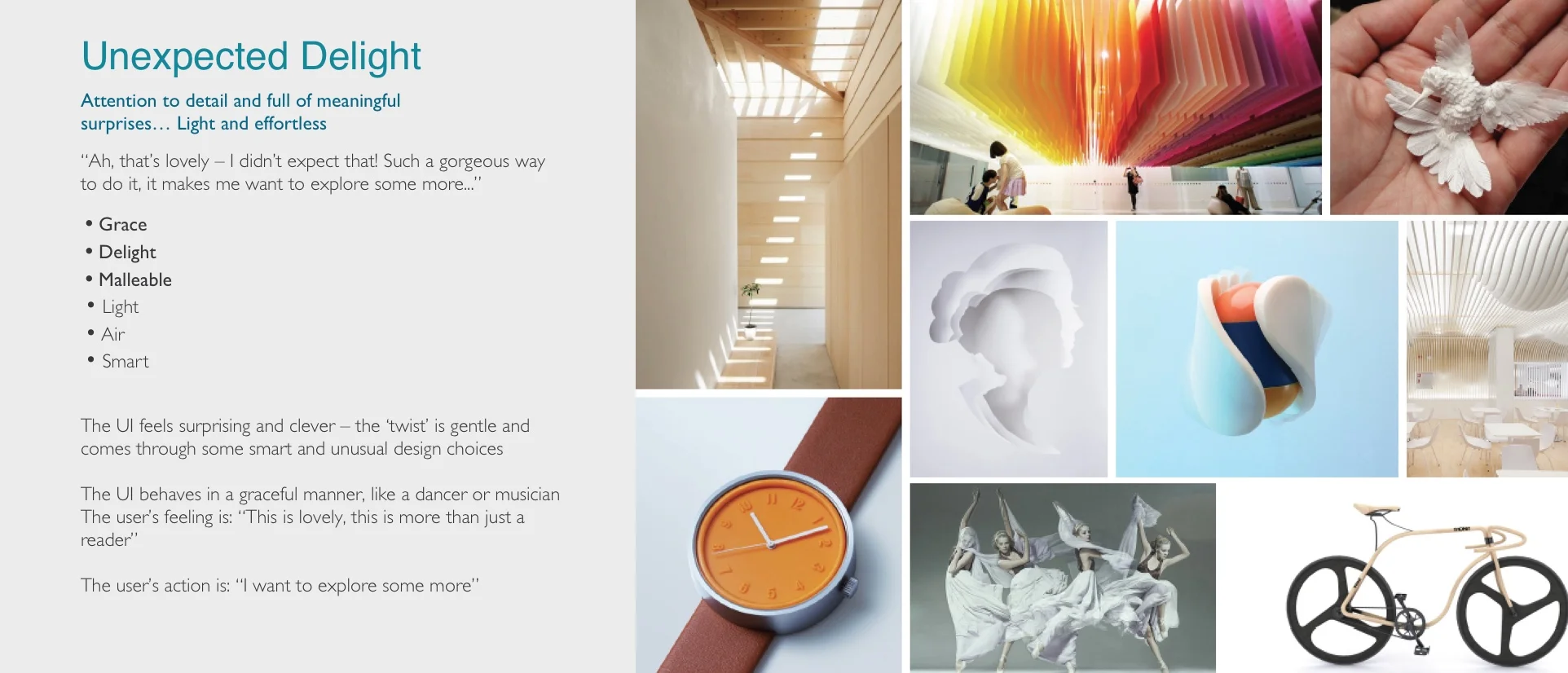
The next step was to create a series of mood boards that communicated the BIG IDEAS for where we believed the NOOK UI should be heading keeping in mind NOOK’s existing brand values. Four core themes emerged that guided our first visual exploration. Each team did a deep dive into one of the concepts in an effort to push the boundaries of possibilities.
The emerging 4 core themes:
The Reader’s Watson
Effortlessly Clever
Seamless Sophistication
Everything & Nothing
2. design principles
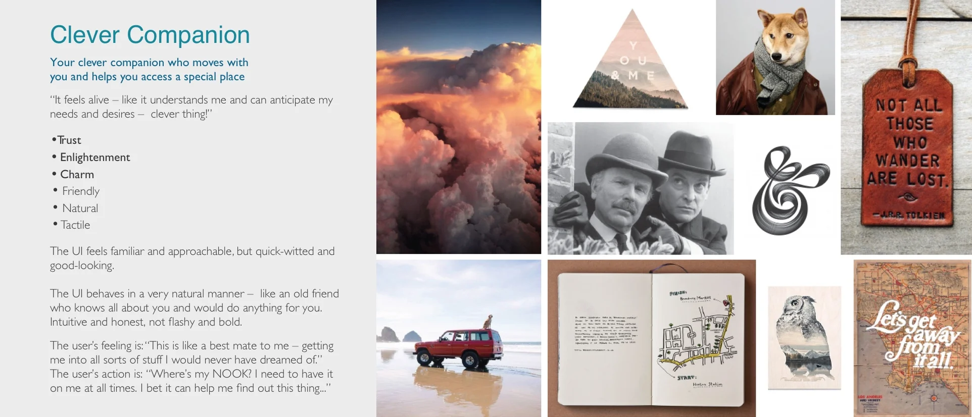
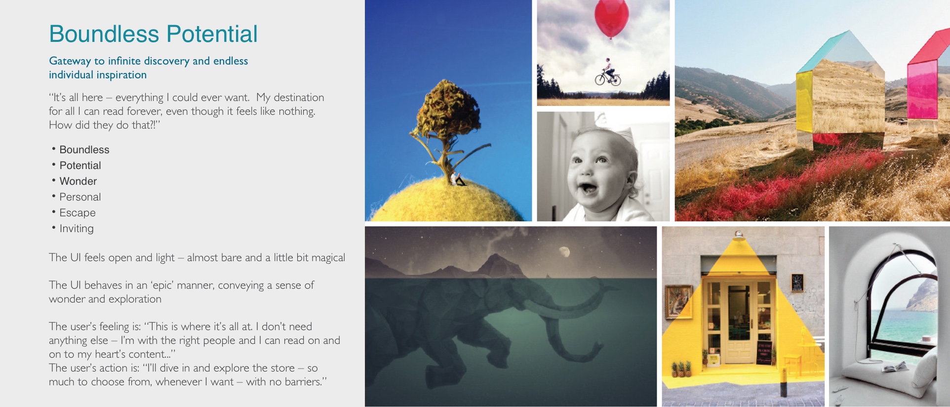
Our 4 core branding themes were critiqued and then synthesized down to 3 distinct design principles that still needed to be visually defined.
Clever Companion
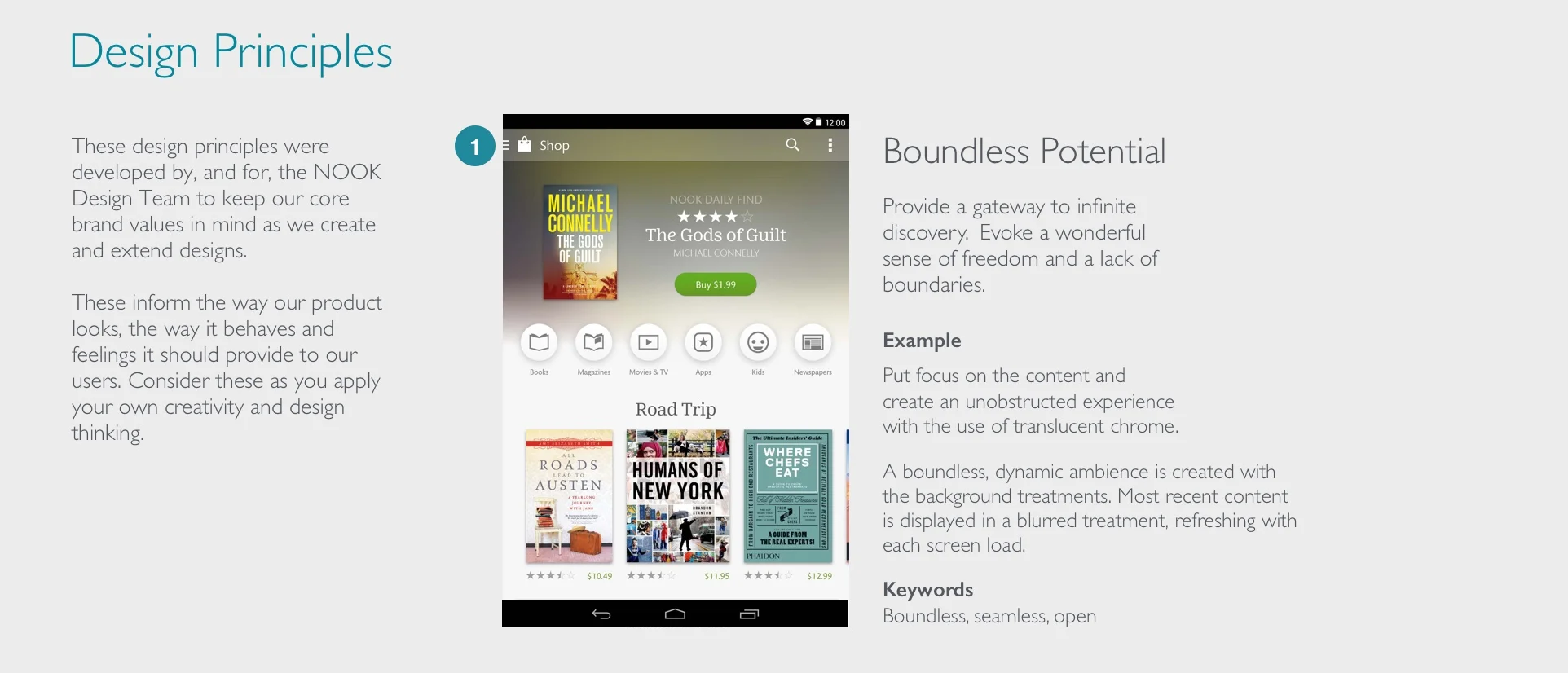
Boundless Potential
Unexpected Delight
We then broke up into 3 teams to begin exploring the personality of each of these 3 design principles. Each team focused on the same key application screens taking into account NOOK’s existing brand values, persona goals and outcome from the workshops. The main goal for each team was to explore a single, siloed design principle in an effort to push the boundaries and visual expression of each principle in order to assess which attributes will best converge into a final clear direction that encompasses the best of everything the team has discovered. This massive amount of visual exploration was distilled down until we arrived at 3 core visual design principles that guided and lead the final visual strategy.
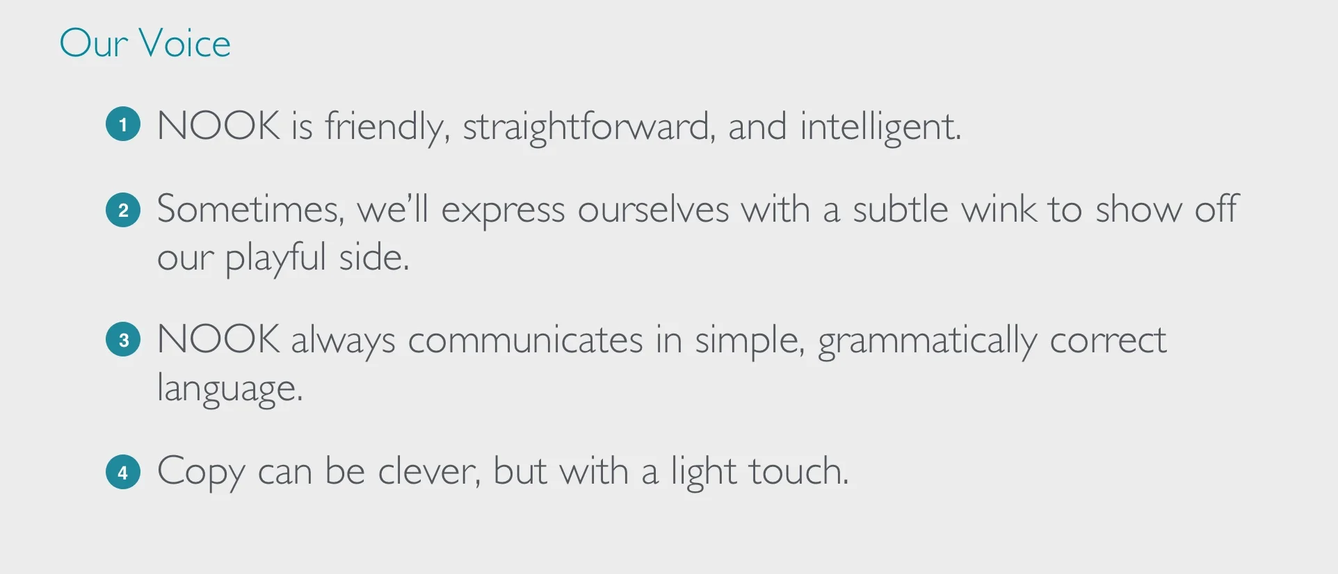
This exploration created the base for our NOOK design language guidelines. Included below is a first compilation of the existing NOOK brand values integrated with NOOK's visual style guide detailing the future direction for global treatments, such as color, typography, and iconography, as well as platform-specific treatments. This is a living document that was created with the understanding that it would evolve and morph in response to future interaction design concepts as the team moved onto developing the interaction models and experiential phase.
3. ux principles
A series of workshops followed to further refine NOOK’s personas and identify both user and business needs around customer journeys. An additional NOOK persona was added to include a future NOOK user as part of the acquisition requirement. These insights were documented, distilled and then synthesized into NOOK’s core ux principles.
Refined Personas
DANIELLE BECKMAN - The first persona included the loyal NOOK customer who currently has a NOOK device and has now become a grandmother leaving her with more time to discover herself and find new interests. She wants to grow intellectually and personally.
CATHERINE SILVA - The second is a mother who is constantly busy running her family, while helping her children throughout the day. Because she is constantly supporting her kids, she needs to find ways to keep her interests alive. She is interested in further developing herself as an individual, so she tries to read novels or other bite size content when free.
JUSTIN MARSHALL - The third and newly added, is a professional male who is constantly on the go. He is a busy individual who is always looking to improve himself when he has the chance. He is a tech savvy person who uses multiple types of platforms for convenience while staying informed on current events. He likes to stay up-to-date with others and current events.
Customer Journeys
By creating a unique narrative for each persona to go through, the group was able to put themselves in the users’ shoes and think about the pain points and then the kind of solutions required to improve the user experience. After this exercise the team was able to map out the high and low points of each persona’s experience.
The Core NOOK UX Principles
One NOOK
Reading First
Embrace Social
Personal Companion
Personal Control
These core UX principles were used to articulate the fundamental goals that all decisions should be measured against and thereby keep the individual features of a project moving toward an integrated whole. Each principle is grounded in user needs but is supported with aligning business goals. Over time it is expected that certain ux principles will evolve in response to updated research along with the discovery of additional pain points throughout the development of this experience.
CONVERGENCE - THE FINAL PHASe
As the initial ux/design team disbursed and moved onto other opportunities outside the NOOK design team I continued to expand, iterate and polish the visual language. Each NOOK feature area still had to be thought through and our new visual language needed to be applied across the entirety of all NOOK devices and sizes.
Working with a ux strategist, product manager and NOOKS business interests, together we arrived at a final NOOK vision for the new Samsung Galaxy, 7 & 10in., and android mobile platform.
View additional Shop design work
PREVIOUS DESIGN ITERATIONS
Working with the concept of boundless borders and backgrounds gradations, snackable sized reading content and mixing relatable content based on user algorithms.
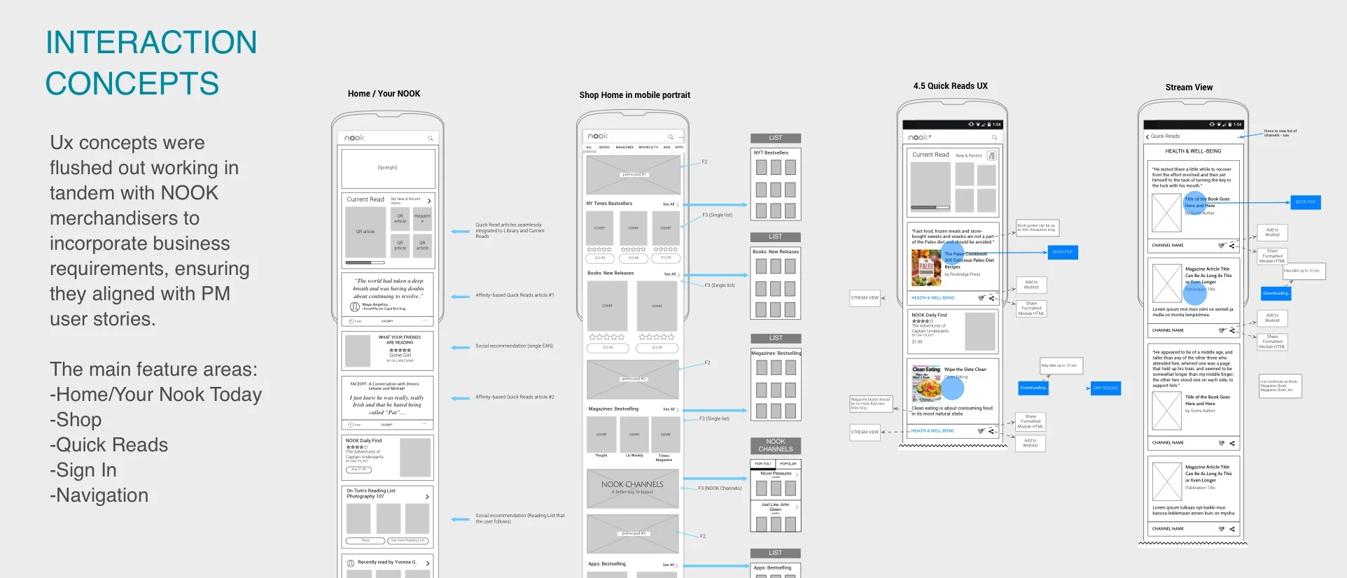
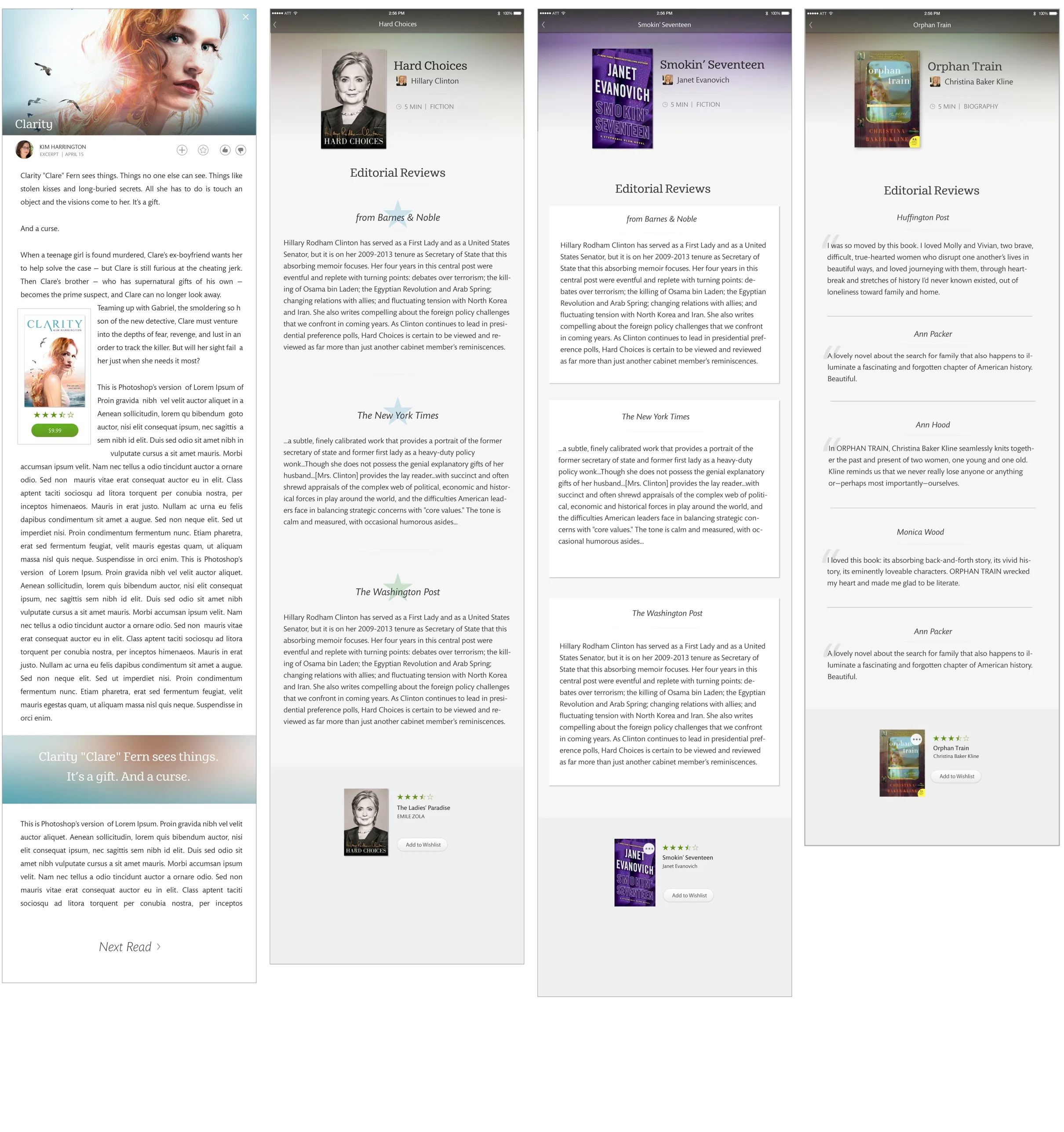
Initial exploration around NOOK Quick Reads, a new NOOK feature that extracts content from NOOK's vast collection of popular content and dynamically populates tiles. Quick Reads specifically targets a users insatiable request for free snackable-sized content.
A user taps on a tile from their HOME or SHOP screen to get to the full screen sized article view seen below.
RIGHT SIDE: Tile exploration for author based quotes pulled from NOOK's trending/popular selling books. The idea was to leverage the loyalty the NOOK reader base had for preferred authors. Quotes were used to engage and remind readers of related content.
LEFT SIDE: Ideas for engagement tiles designed to gather user preferences without forcing a user to go through a series of picker questions.


