TANGO DESIGN PRINCIPLES
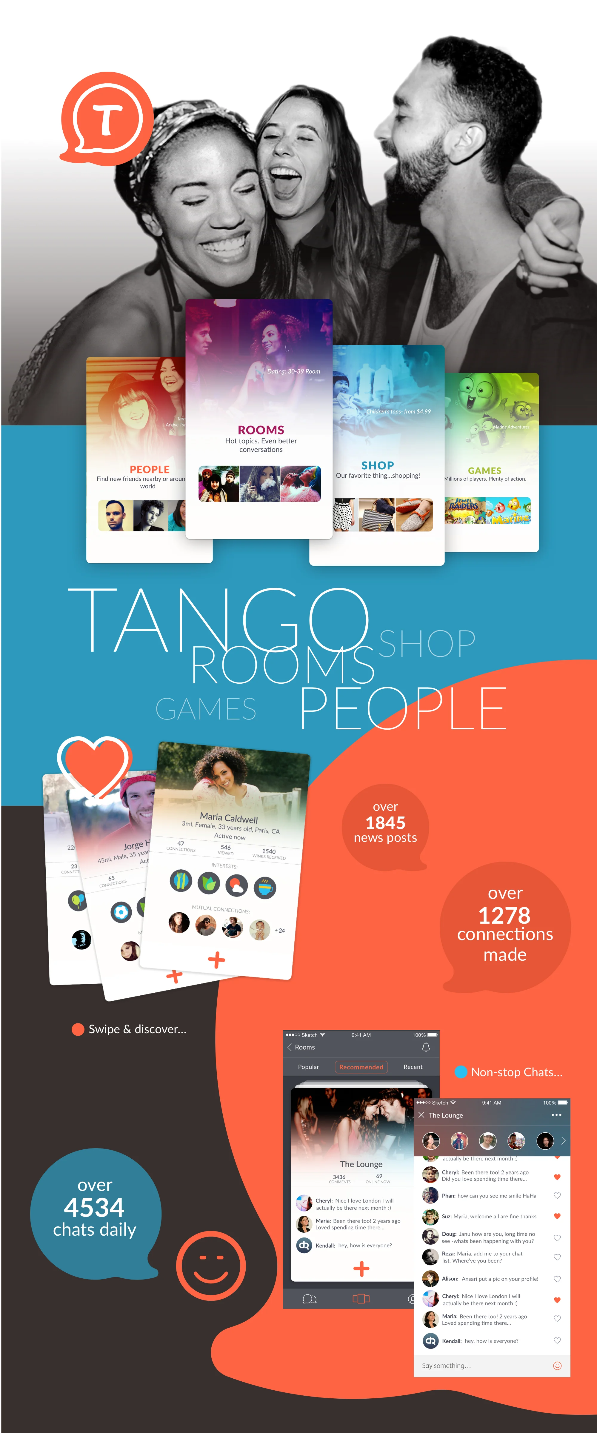
Tango Key Application Screens
Tap to enlarge
TANGO RE-DESIGN
TANGO OVERVIEW
Tango is a leading mobile messaging service with more than 300 million registered members around the world. Evolved from its beginnings in 2009 as a popular, free, cross platform video and voice calling app, Tango today combines communication, social networking, and content in a single platform.
As part of Tango’s explosion of growth its founders wanted to differentiate themselves from the pack of popular messaging apps. The evolving direction of Tango’s social platform centered on helping people discover, create and nurture relationships through rich conversation & shared experiences.
A Tango application re-design was initiated along with an update to their brand values and design guidelines.
The Tango design team worked side-by-side with an outside user experience agency to further evolve the Tango brand values and comprehension of what that means through a series of workshops. Five Tango brand values were solidified and documented with well thought-out descriptions that ended up being strategic for flushing out the new Tango design language.
Each of the brand values were assigned to one of five design teams who spent 2 weeks exploring and pushing the boundaries of how to best translate each word into engaging shapes, colors and expressions. From there the designers were divided into 2 teams tasked with using the existing 5 brand-value based themes as inspiration to flush out a distilled version. A final style was chosen that embraced and best expressed the evolving Tango brand values.
MY ROLE
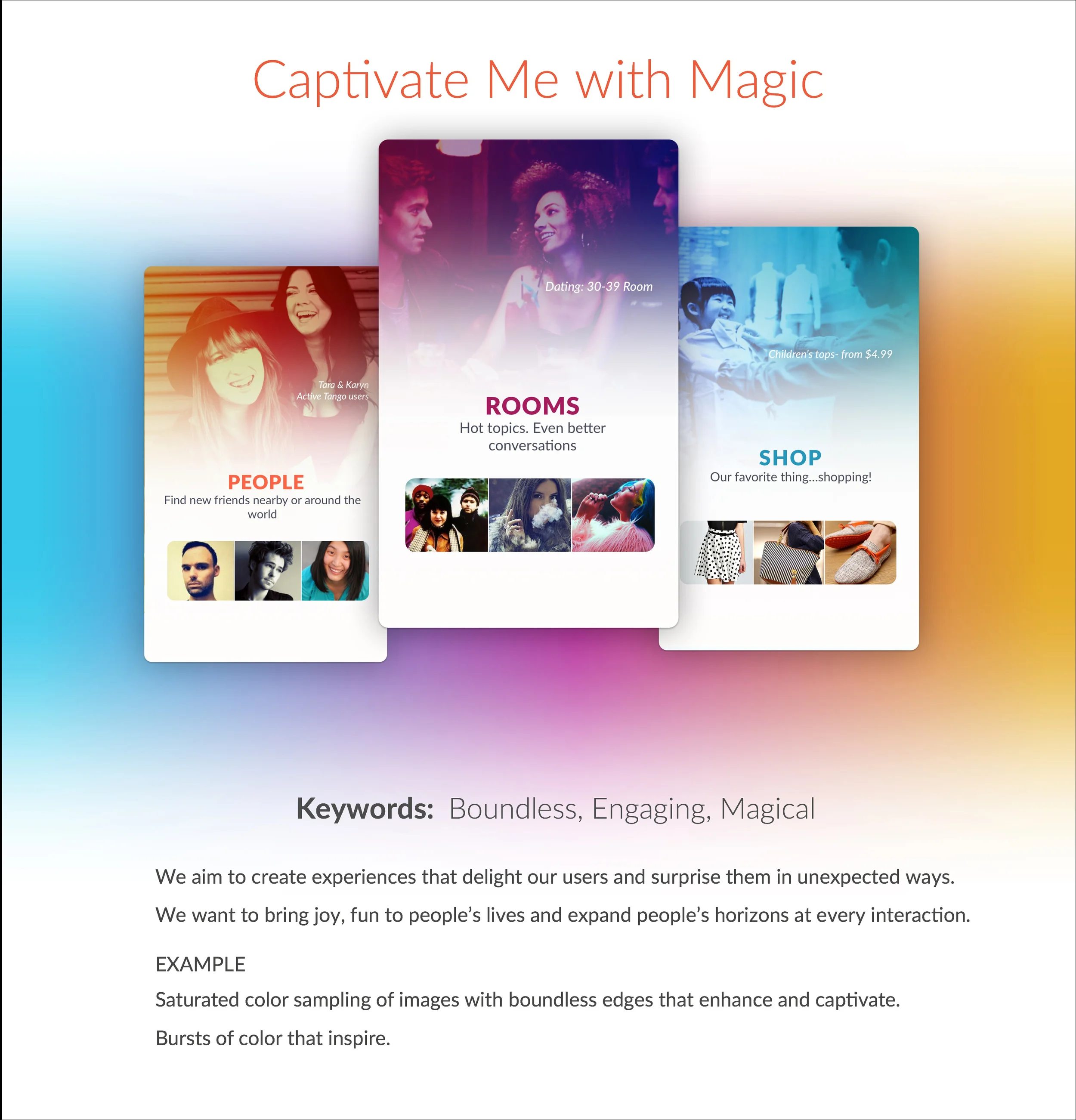
As the creative lead for the team who's visual style was chosen I opted to pull native platform effects from both platforms (iOS & android) since Tango has users on both platforms and the goal was to create one unifying design language and strategy. I blended the iOS visual strategy of using color sampling pulled from content to complement user content (since most user content was fairly poor quality) with the android material design effects of color sampling. The card stack concept used through out was a feature taken from the initial design.
TANGO BRAND VALUES
The five Tango brand values of Bold, Captivating, Welcoming, Playful and Alive became my inspiration for the remaining carousel navigation cards design and content treatment as well.
The Tango brand values as reflected in the re-design:
•The Boldness of the aspiration of the Tango brand to be a challenger and break new ground both in style and experience. Opinionated use of images as content. Dynamic content that is timely and personal.
•The Captivating use of the Tango color palette that engages users and drives them to interact with content.
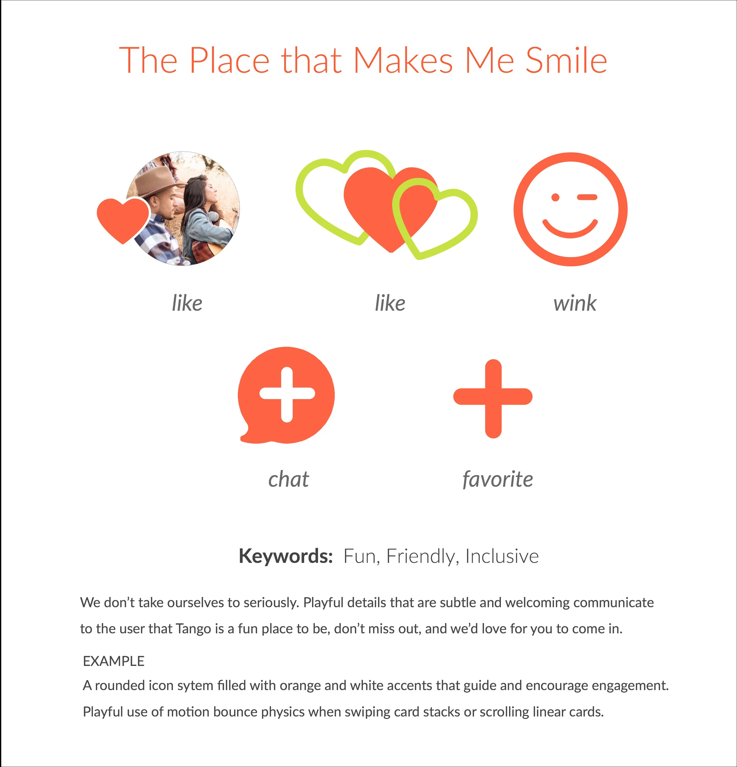
•The Welcoming and Playful use of the Tango voice, tone, UI and transitional elements.
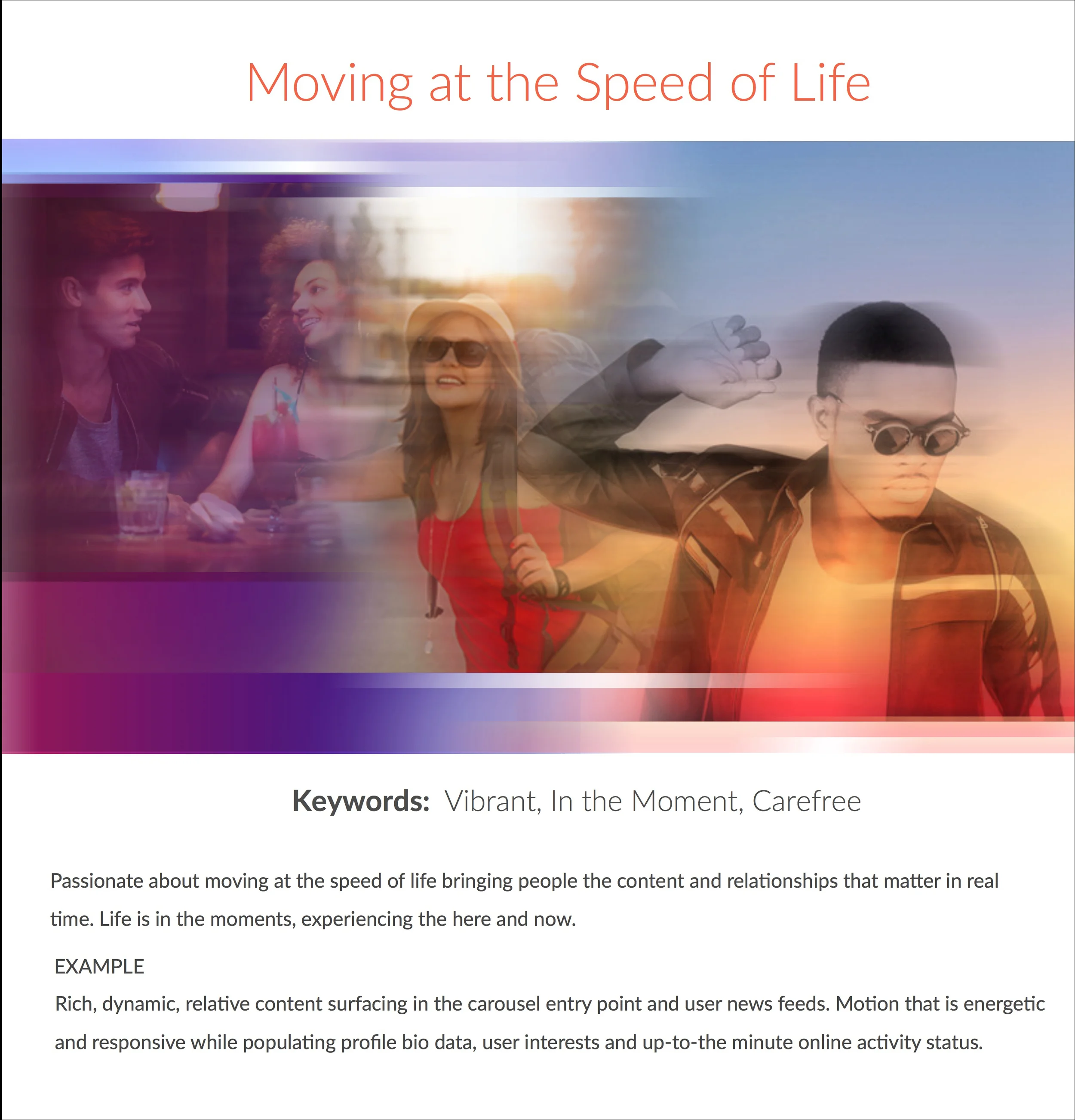
•The sense of being Alive and plugged in by the mesmerizing speed of chats in Rooms and swipes used in Discover to make new connections.


